Under fresh leadership and brimming with personality, the Three Fat Ducks team embarked on a mission to infuse their local coffee house with a lively ambiance tailored to appeal to young families. Injecting a dose of laid-back humor was paramount to their rebranding efforts, slated to extend across both their in-house point of sale and social media platforms.
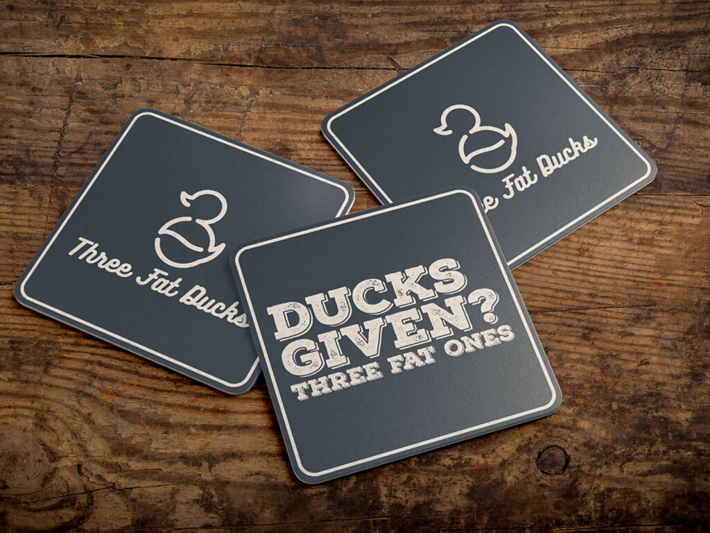
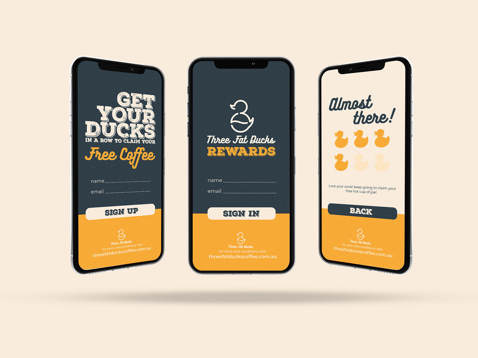
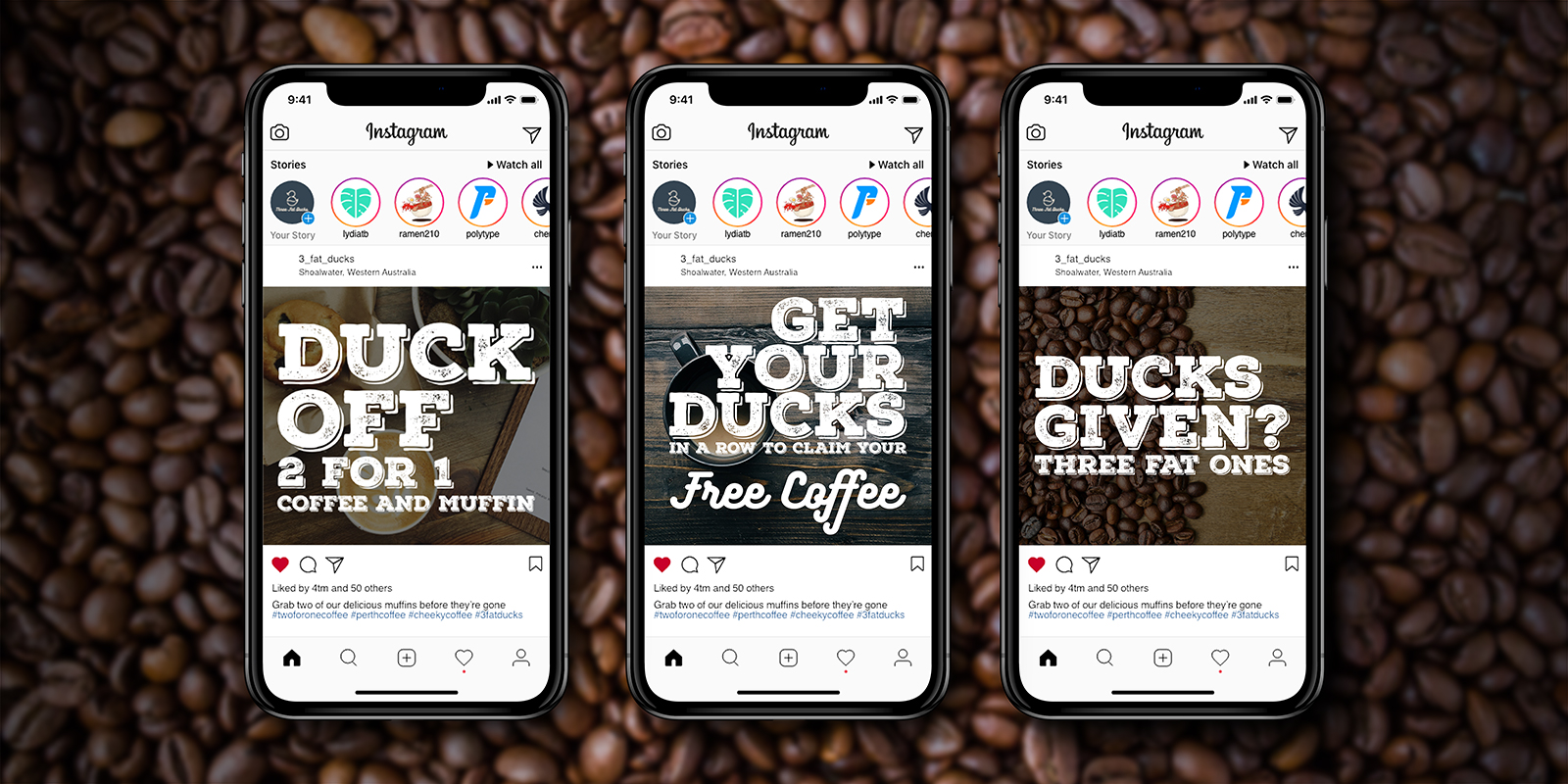
To breathe life into their vision, a series of tongue and cheek slogans were crafted, designed to spark interest and drive engagement, particularly during promotional periods such as 2-for-1 deals. Additionally, plans were set in motion to integrate an app-based rewards program, further enhancing customer loyalty and satisfaction.
Simultaneously, social media channels were established to amplify brand awareness. The response from the local community was overwhelmingly positive.
Avoiding clichés while infusing the brand with personality, the logo blends three key elements: a coffee bean, the numeral 3, and, of course, a plump duck. This playful combination strikes the perfect balance, capturing the essence of the brand without veering into predictability.
Complementing the logo is a rounded script font, chosen for its ability to harmonize seamlessly with the logo aesthetic. This cohesive typography scheme lends a sense of unity to the brand identity, reinforcing its quirky yet approachable character.
For social media posts, a bold heading font was selected to ensure maximum impact. This dynamic typography not only amplifies the brand’s messaging but also serves to enhance the visual appeal of their digital presence.